
Visual identity is a brand’s visual representation, encompassing logos, color schemes, typography, imagery, and overall design style. These elements work together to create instant recognition, helping consumers connect emotionally with the brand. A strong visual identity fosters a cohesive image that stands out in a competitive market. Its importance goes beyond aesthetics, evoking feelings and associations through color psychology, where vibrant colors can convey energy and muted tones signify sophistication. Typography also enhances this message, with its varied styles communicating different brand personalities. A solid visual identity enables companies to express their values and story without words, serving as a crucial point for customer engagement and loyalty.
Creating a Mood Board with Adobe Express
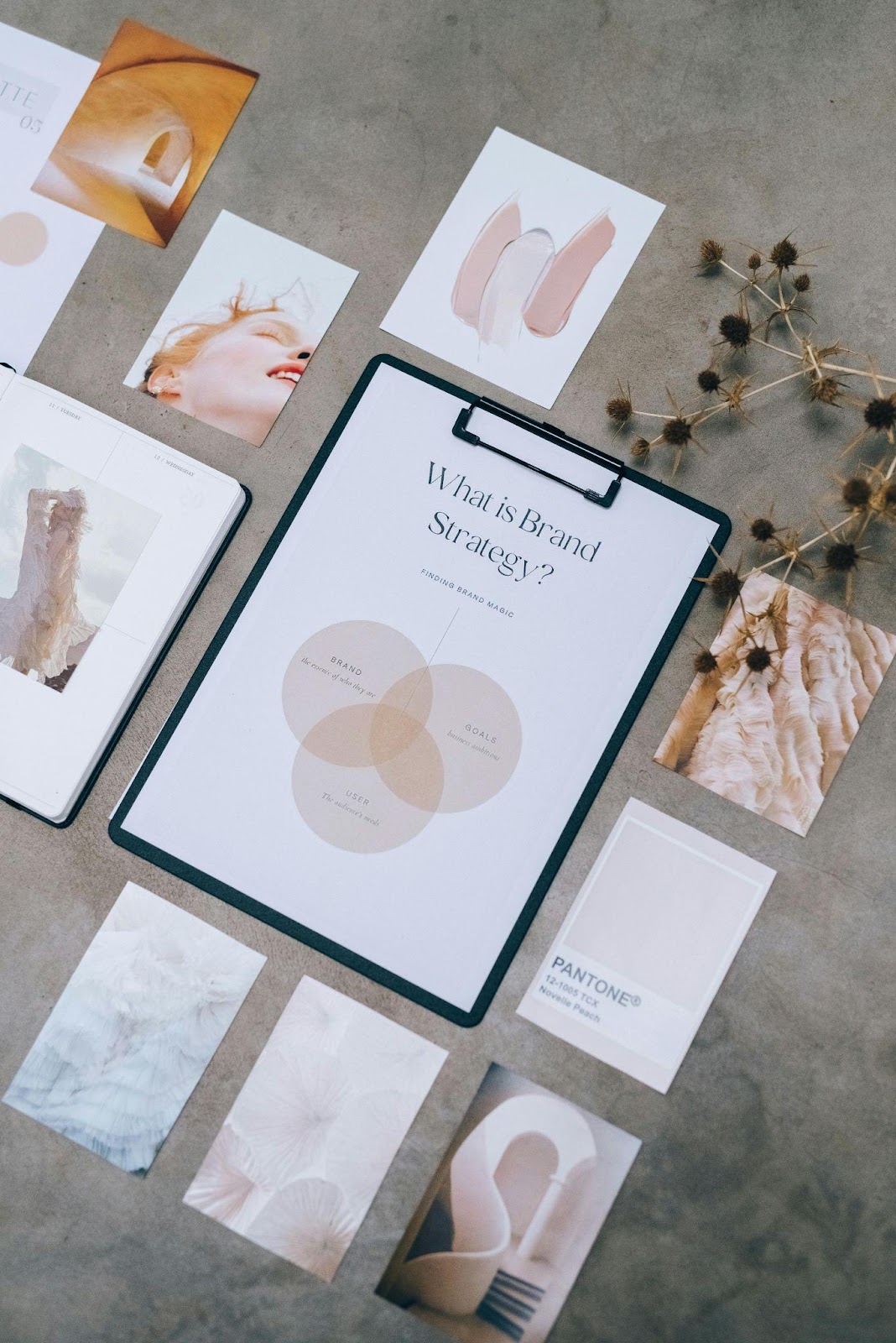
Creating a mood board is an exciting way to visualize your brand’s identity and set the tone for your creative projects. Start by defining your purpose. What feelings, messages, or themes do you want your mood board to convey? This foundational step shapes the content you’ll bring together. Gather inspiration from a variety of sources: images, color palettes, textures, typography and even words that resonate with your vision and get an impactful mood board using a moodboard creator in minutes that helps you achieve this. Save anything that catches your eye; you can always refine later.
Once you have an assortment of elements, it’s time to curate and organize. Open Adobe Express mood board tool and begin a new project, selecting the dimensions that work best for your needs. Drag and drop your selected inspirations onto the canvas, layering them in a way that communicates harmony and cohesion. Feel free to experiment with different layouts—try grid arrangements for a more structured feel, or let images overlap to create a more dynamic look. As you position visuals, start to analyze how they interact with each other. Do certain colors pop against specific backgrounds? Are there recurring themes or styles that emerge? This process of elimination becomes essential; the goal is to make a mood board that truly reflects your brand’s visual identity, leaving behind the clutter that doesn’t serve your vision.
Selecting Images for Your Mood Board
Selecting the right images for your mood board is a crucial step in defining your brand’s visual identity. The first thing to consider is the overall vibe and emotion you want to convey. Are you aiming for something warm and inviting, or sleek and modern? Once you have a sense of this, it’s time to search for visuals that reflect those feelings. Start by gathering a diverse array of images, including color palettes, typography examples, and photographs that resonate with your brand’s mission. Remember to keep your target audience in mind; the images should evoke a connection with them, making them feel seen and understood.
Now, when it comes to sourcing your visuals, a moodboard creator will give you two primary options: stock images or personal photos. Stock images offer a vast library of professional visuals, making it easy to find options that fit your aesthetic without starting from scratch. Just be mindful of selecting images that look authentic and align with your brand’s personality—generic visuals can dilute your message. On the flip side, using personal photos can add a meaningful touch. Whether it’s images from your team events, product shots, or even behind-the-scenes snapshots, these can help create a narrative unique to your brand. Combine these with carefully curated stock photos to achieve a balanced and comprehensive mood board. Ultimately, selecting images is about telling your brand story visually, and the right mix will be the key to unlocking a compelling brand identity.
Finding the Right Visuals
When diving into the world of mood boards, identifying the right visuals is akin to choosing the perfect ingredients for a culinary masterpiece. You’re not just picking pretty pictures; these visuals need to serve a purpose and speak to your brand’s essence. Start by defining your brand’s core values, target audience, and the visual narrative you wish to convey. This foundational understanding will serve as a compass, guiding your search for images that resonate emotionally and aesthetically with the viewers you aim to engage.
A great way to source potential visuals is through a mix of online platforms and personal collections. Websites offer a treasure chest of inspiration, allowing you to explore diverse styles and concepts. Don’t shy away from using keywords that connect with your brand’s persona; for instance, if you’re leaning toward sustainability, search for visuals featuring nature, greens, or eco-friendly design elements. Borrowing from your own life might also yield some gold. Personal photographs that encapsulate your brand’s vibe can add a unique, authentic touch that stock images often lack. Once you’ve collected a variety of images, take a moment to reflect on how each piece contributes to the overall mood you’re trying to create. Use an easy to use moodboard creator to keep iterating and refining until you feel that the visuals truly encapsulate your brand’s spirit. After all, the right visuals can evoke the emotions you seek to elicit, whether it’s joy, trust, or inspiration, and pave the way for a compelling brand narrative.
Choosing Colors that Align with Your Brand
When it comes to brand visual identity, the colors you choose aren’t just about aesthetics; they play a pivotal role in how your audience perceives your brand. Each color evokes specific feelings and associations, and understanding color psychology can set the groundwork for meaningful interactions with your audience. For instance, blue often conveys trust and reliability, making it a popular choice for brands in finance or healthcare. On the flip side, red can stoke excitement and urgency, which is perfect for industries focusing on fast-paced sales or high-energy experiences. Consider how you want consumers to feel when they encounter your brand—do you want to inspire confidence, or maybe evoke a sense of fun? The flavors of color psychology should inform your choices, helping you communicate your brand values through your color palette.
Once you establish your brand’s emotional messaging, the next step is crafting a cohesive color palette. This is where things get creative and where your vision can truly shine. Start by selecting a primary color that encapsulates your brand’s essence. This will serve as the cornerstone of your visual identity. From there, think about complementary colors; they may be secondary hues that enhance or contrast with your primary choice. As you build your palette, remember the importance of versatility—your colors should work well across various mediums, from a business card to a social media post. It’s also crucial to ensure accessibility; this means considering how your color choices will appear to individuals with color vision deficiencies. Striking the perfect balance between aesthetic appeal and functional clarity will ensure your brand is visually compelling and easily recognizable.
Typography Choices for Brand Identity
When it comes to brand identity, typography plays a significant role in visually expressing a brand’s personality and values. The right typeface can evoke emotions, create impressions, and establish a connection with your audience—essentially serving as an unseen window into your brand’s soul. It’s not just about picking a pretty font; it’s about understanding font styles and their psychological impacts. For starters, each font has its unique flavor—serif fonts can lend an air of reliability and tradition, while sans-serif fonts feel modern and clean. Script fonts, on the other hand, might evoke elegance and creativity. By carefully selecting a font that aligns with your brand’s ethos, you’re actively shaping how your audience perceives you.
Pairing fonts effectively is just as crucial as choosing the right ones individually. A successful font pairing can create harmony in your design, while a poor combination can lead to confusion and a disjointed brand image. The key is to strike a balance: contrasting yet complementing your choices enhances visual interest without overwhelming viewers. For instance, you might use a bold sans-serif for headers for maximum impact combined with a more understated serif for body text, ensuring readability while still capturing attention. When selecting a secondary typeface, consider attributes such as weight, size, and style, ensuring both fonts share a common thread—like a similar x-height or contrast ratio.
Aligning Mood Boards with Brand Values
When it comes to crafting a compelling visual identity for a brand, aligning your mood boards with your brand values is paramount. Brand values serve as the guiding principles that dictate a brand’s behavior, messaging, and visual representation. To kick things off, it’s essential to define what your brand stands for. Are you all about innovation, sustainability, community engagement, or perhaps luxury? Whatever the case, these core values should act as the backbone of your visual strategy. Start by articulating these values clearly; think about how you want your audience to feel and what you want them to associate with your brand. This clarity will set the stage for everything that follows.
Once your brand values are firmly established, the next step is to reflect them in your visual choices on the mood board. For instance, if sustainability is one of your brand’s core values, consider incorporating earthy colors and natural textures into your mood board. Imagery of eco-friendly products, community initiatives, and an elevated take on minimalism can powerfully convey this message. The goal here isn’t just to curate pretty pictures but to create a visual story that echoes your brand’s ethos. Each element, from typography to color palette, should resonate with the guiding principles you’ve set. Consistency is key; when your visuals align with your values, it fosters authenticity, which is increasingly important to consumers today.
Conclusion
Ultimately, embracing mood boards can significantly enhance a brand’s visual identity, providing clarity, coherence, and personality. Selecting elements for a mood board goes beyond decoration; it creates an unforgettable experience for consumers. In today’s visual communication-focused world, investing time in a well-thought-out mood board can help brands not only stand out but also resonate deeply with their audience. Consistency, inspiration, and clarity are key for impactful brand identity, and mood boards are a vibrant first step to achieving these objectives. Whether seasoned or a newcomer in design, harnessing the potential of mood boards is vital in the ever-evolving landscape of brand identity.